You might have encountered a situation where you needed a fully responsive square div.
In my case, I was working on a responsive portfolio kind of layout, and I soon realized it's pretty hard to get a responsive square based on the width.
However, I found the perfect solution and will be showing you how to achieve this in CSS and even in Tailwind!
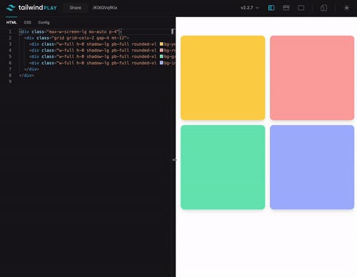
Let's take a look at the result:

CSS Responsive square div
Let's first look at how we would achieve this effect in pure CSS before moving to Tailwind.
The general concept is pretty simple. We want to create a percentage-based width div and use the same percentage as our padding-bottom.
Let's see that in action:
<div class="square"></div>
And then for the CSS:
.square {
  width: 50%;
  padding-bottom: 50%;
  background-color: teal;
}
And this will result in a div that is 50% of the parent. The height will reflect this as well.
You can have a play with this CodePen to see it in action. (Try to resize your screen)
Tailwind responsive square div
Now taking this concept, we can achieve the same effect in Tailwind. However, we'll need to make one addition to our config for it.
Let's start with the basics:
<div class="w-1/2 bg-purple-300"></div>
However, we don't see anything with the above code as we don't have the padding option. And the padding options in Tailwind don't have a percentage-based value.
But, no worries, we can fix that.
Open up your tailwind.config.js file and extend the padding section.
In our case we are using a 50% div (w-1/2) so we need a 50% padding as well:
module.exports = {
  mode: 'jit',
  purge: ['./public/**/*.html'],
  darkMode: false, // or 'media' or 'class'
  theme: {
    extend: {
      padding: {
        '1/2': '50%',
        full: '100%',
      },
    },
  },
  variants: {
    extend: {},
  },
  plugins: [],
};
As you can see, you can add multiple versions for whichever size you need.
Now let's add this class to our div as well to see the result:
<div class="w-1/2 pb-1/2 bg-purple-300"></div>
And that gives us a perfect square in Tailwind!
I've created a tailwind playground for you to see this in action:
Thank you for reading, and let's connect!
Thank you for reading my blog. Feel free to subscribe to my email newsletter and connect on Facebook or Twitter

