Now that we have written our first story, which renders a relatively static component let's see how we can make it a bit more interactive.
For this, we have two elements to take a closer look at, the one being args and the other parameters.
Storybook args
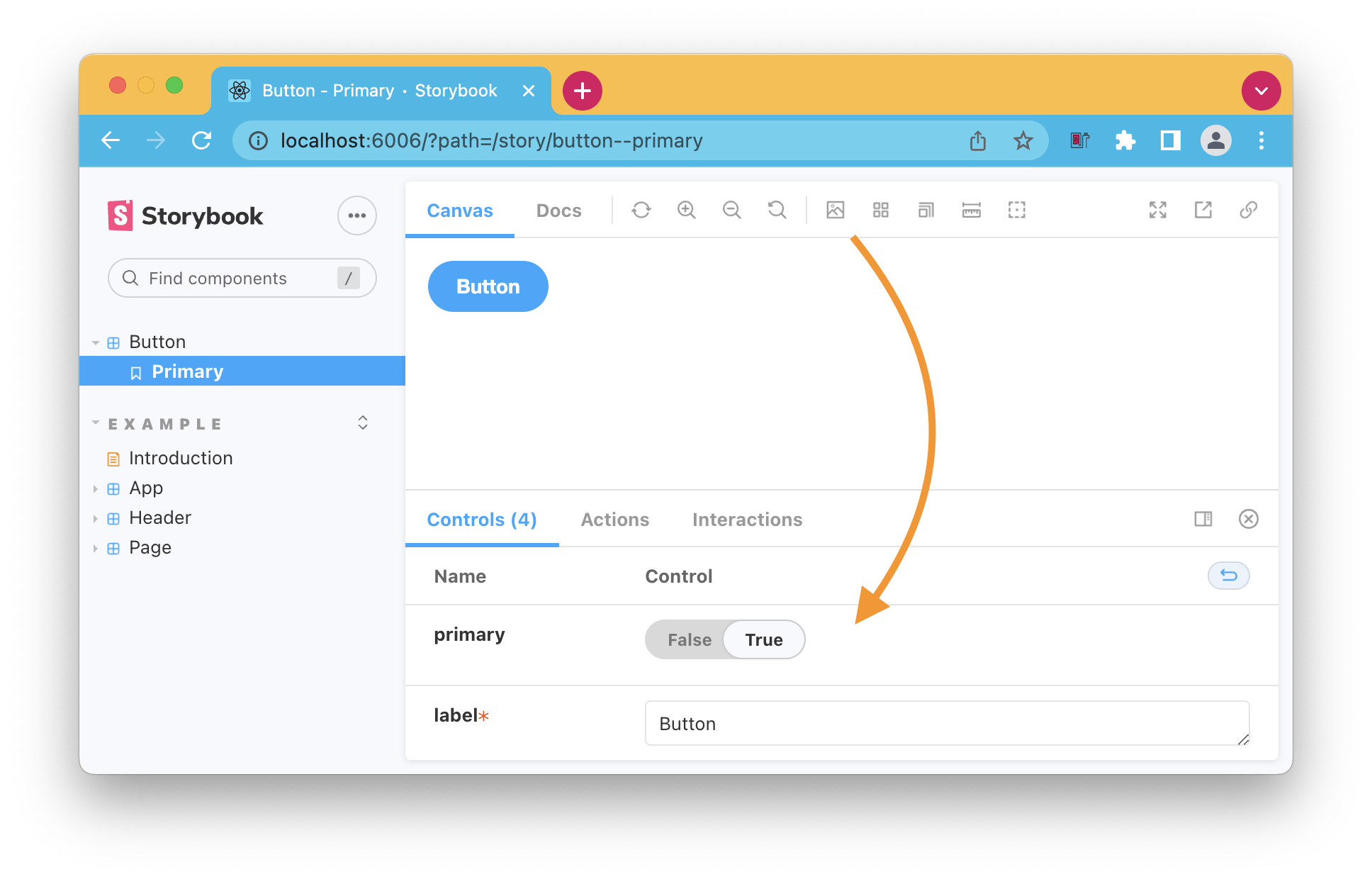
Args are a set of arguments that define how the component should render. Args are Storybook's way of describing those. The cool part is that we can change them on the fly within Storybook.
Let's see how we can add some args to the Button component, for instance.
The first thing we'll have to add is a template. This is our component with the args added.
const Template = (args) => <Button {...args} />;
We can start by adding the first story, where we can add these args.
export const Primary = Template.bind({});
Primary.args = {
  primary: true,
  label: 'Button',
};
And now, if we run our Storybook, you'll see the component rendered with these arguments, but at the bottom, we get the option to change those!

We can reuse those for any other stories in this file.
export const Secondary = Template.bind({});
Secondary.args = {
  ...Primary.args,
  primary: false,
};
This will render the same component with the label, but the default primary value will now be false.
Alternatively, you can define the args on a component level like this.
export default {
  title: 'Button',
  component: Button,
  args: {
    primary: true,
    label: 'Button',
  },
};

const Template = (args) => <Button {...args} />;

export const Primary = Template.bind({});

export const Secondary = Template.bind({});
Secondary.args = {
  primary: false,
};
And in this example, each story we define will start with the primary state. In the secondary case, we overwrite that value.
Storybook parameters
Next to args, we also get parameters, which say something about the story's environment.
A typical example would be the theme.
Again we can add it to a singular story like this.
Primary.parameters = {
  backgrounds: {
    values: [
      { name: 'red', value: '#f00' },
      { name: 'green', value: '#0f0' },
      { name: 'blue', value: '#00f' },
    ],
  },
};
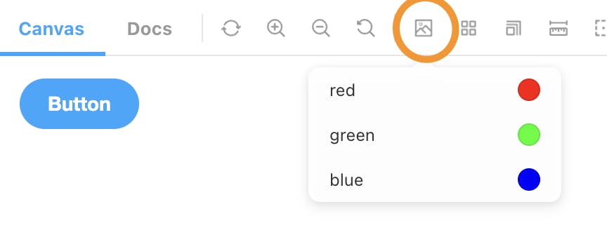
This will now show up at the Storybook top menu like this.

However, more common would probably be to set it for the whole story like this.
export default {
  title: 'Button',
  component: Button,
  parameters: {
    backgrounds: {
      values: [
        { name: 'red', value: '#f00' },
        { name: 'green', value: '#0f0' },
        { name: 'blue', value: '#00f' },
      ],
    },
  },
};
Besides these methods, we also get an option to set these elements for all components.
We can create a preview.js file in our .storybook file and add it like this.
export const parameters = {
  backgrounds: {
    values: [
      { name: 'red', value: '#f00' },
      { name: 'green', value: '#0f0' },
      { name: 'blue', value: '#00f' },
    ],
  },
};
Thank you for reading, and let's connect!
Thank you for reading my blog. Feel free to subscribe to my email newsletter and connect on Facebook or Twitter

