The other day I posted this article on how to create square divs in Tailwind CSS. The code works, and there is nothing wrong with it. However, it is a bit of a "hack" to do this.
In the past, I've written about CSS Aspect ratio and at the time of writing that it wasn't well supported.
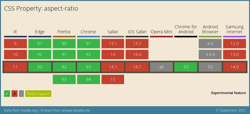
When I published the Tailwind article IgnusG mentioned on Daily.dev that aspect ratio is now well supported.

So taking another look at aspect-ratio, it is way better supported, and another winning aspect is that it comes as a Tailwind plugin!

Already improved, and it's coming to Safari in the technology preview. You can keep an eye out here for the live graph.
Using the Tailwind aspect ratio plugin
Let's start by adding the tailwind aspect ratio plugin to our project.
npm install @tailwindcss/aspect-ratio
Next, up we need to register it in our tailwind.config.js file as such:
module.exports = {
  theme: {
    // ...
  },
  plugins: [
    require('@tailwindcss/aspect-ratio'),
    // ...
  ],
};
And as we learned from our CSS aspect ratio article, we need to define the width and height of the aspect ratio.
The plugin gives us these two classes for that:
aspect-w-{x}aspect-h-{x}
Where x can be a number between 1 and 16. In our case, we want a square, so we'll be using 1 and 1.
<div class="w-full h-0 shadow-lg aspect-w-1 aspect-h-1 rounded-xl bg-yellow-300"></div>
In action that will result in this:

You can also try it out in this Tailwind Playground.
A big thanks to Ignus for pointing out that this is now well supported! 🎉 Lovely how the community points these things out so we can all learn from them.
Thank you for reading, and let's connect!
Thank you for reading my blog. Feel free to subscribe to my email newsletter and connect on Facebook or Twitter

