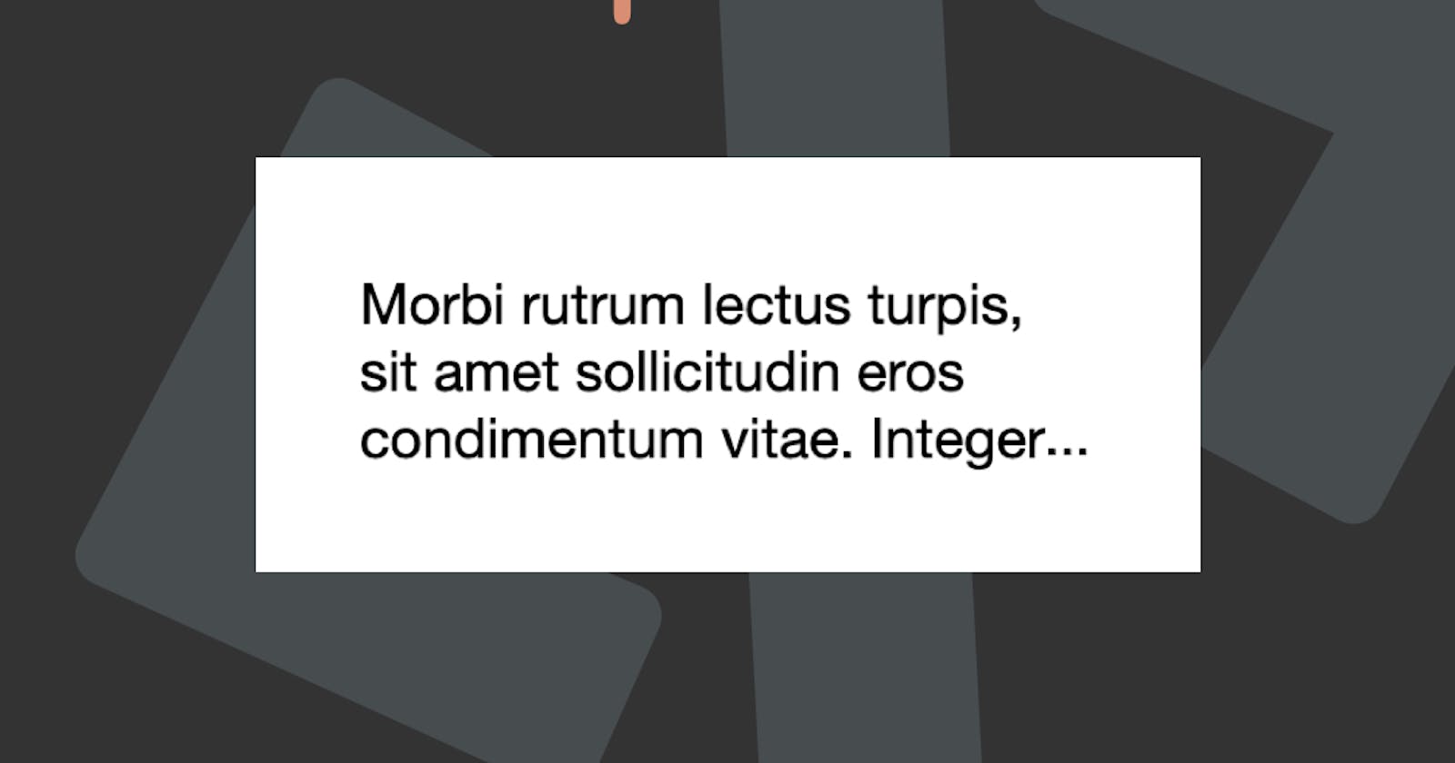
At one stage, this was hype, instead of just showing the whole text, which could be one or five lines. We ended up doing the ellipsis... for only one line.
This means it would show a text and truncate itself with the three dots.
HTML Structure
<h1>
  “In my experience there is no such thing as luck.” – Obi-Wan Kenobi
</h1>
Nothing fancy, just a heading which we will make smaller and truncate.
CSS Truncate Ellipsis
To make the truncate we use the following CSS
.truncate {
  width: 200px;
  white-space: nowrap;
  overflow: hidden;
  text-overflow: ellipsis;
}
That is the minimum requirement.
width; needs to be defined since this will only work for a one-linewhite-space: nowrap; Wraps the line no matter where it endsoverflow: hidden; Because we don't want to show the other texttext-overflow: ellipsis; This is what adds the three dots.
View this demo on Codepen.
Truncate Multiple Lines
This works well, but what if we want to truncate on multiple lines?
Note: There are a lot of options here, and I'm only going to walk through the CSS options. (NOT the
JavaScriptones)
For the HTML part we are using the following demo:
<div class="content">
  <p>
    Morbi rutrum lectus turpis, sit amet sollicitudin eros condimentum vitae. Integer
    consequat eros vel tortor tempor, et vulputate turpis pretium. Suspendisse vel metus
    sem. Aenean sollicitudin luctus est ac gravida. Curabitur eros tellus, scelerisque sit
    amet suscipit consequat, laoreet at quam. Nullam massa ante, tincidunt quis metus ut,
    consequat facilisis risus. Orci varius natoque penatibus et magnis dis parturient
    montes, nascetur ridiculus mus.
  </p>
</div>
Webkit Flexbox Truncate
We can do one solution, and by far, is this the easiest is using the old webkit/flexbox way.
Note: This method is very easy, but not supported in all browsers and very limited in styling.
.line-clamp {
  display: -webkit-box;
  -webkit-line-clamp: 3;
  -webkit-box-orient: vertical;
}
Pure CSS Truncate
Another way which would be better supported, but more difficult to setup is to use calculated heights.
html {
  --lh: 1.4rem;
  line-height: var(--lh);
}
.content.truncate-overflow {
  --max-lines: 3;
  position: relative;
  max-height: calc(var(--lh) * var(--max-lines));
  overflow: hidden;
  padding-right: 1rem;
}
.content.truncate-overflow::before {
  position: absolute;
  content: '...';
  bottom: 0;
  right: 1rem;
  z-index: 1;
}
.content.truncate-overflow::after {
  content: '';
  position: absolute;
  bottom: 0;
  right: 1rem;
  width: 1rem;
  height: 1rem;
  background: #fff;
  z-index: 0;
}
Let's dive a bit keeping into what's happening here:
html {
  --lh: 1.4rem;
  line-height: var(--lh);
}
We are defining the basic line-height and assigning it to the property (we need this later on).
.content.truncate-overflow {
  --max-lines: 3;
  position: relative;
  max-height: calc(var(--lh) * var(--max-lines));
  overflow: hidden;
  padding-right: 1rem;
}
Here we make a new variable to define the number of lines we want to show.
We then set the max-height of this element to be the number of lines times the line-height.
And we set the overflow: hidden.
Next, we add a padding-right, where we will place the actual ellipsis.
.content.truncate-overflow::before {
  position: absolute;
  content: '...';
  bottom: 0;
  right: 1rem;
  z-index: 1;
}
The before Pseudo-element is used to show the actual dots, and is placed on the right side.
.content.truncate-overflow::after {
  content: '';
  position: absolute;
  bottom: 0;
  right: 1rem;
  width: 1rem;
  height: 1rem;
  background: #fff;
  z-index: 0;
}
Then we add an after to place under the dots, so they lay over any content that might be there still.
You can find these two methods on the following Codepen.
Thank you for reading, and let's connect!
Thank you for reading my blog. Feel free to subscribe to my email newsletter and connect on Facebook or Twitter

