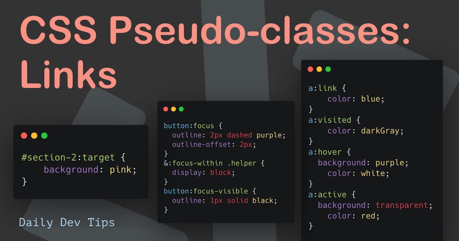
We already had a look at CSS pseudo-elements, and even how to use pseudo-elemtns in Tailwind CSS.
But then I realized I've never talked about pseudo-classes, and they are pretty substantial as we use them all the time in web development.
So this article is dedicated to pseudo-classes.
Pseudo-classes can be used to style based on a certain state of an element. States could be that the user hovers an element or is an element is invalid.
I've split this up into a series of four, where this is the first part about link pseudo-states.
The other parts:
- Link pseudo-states (this one 💖)
- Form pseudo states (coming soon)
- Element state selectors (coming soon)
- Other pseudo states (coming soon)
Link pseudo-states
One of the more common use-cases is to apply styling to link elements.
The options we get here are as follows:
:link: Unvisited links:visited: Visited links:active: Currently interacting with it, like a click:hover: Mouse hover over it:target: When a user clicks an anchor target like#section-1:focus: Tabbed to this element, or input has the focus:focus-within: If a child element has the focus:focus-visible: Can be used to apply focus styles on keyboard events only
:link & :visited
The :link selector can be applied to indicate which pages have already been visited by the user.
It's often used to make a link appear less bright, so the user knows he already visited that page.
In the following example, I've made the default links blue, and once you visit them, they turn gray.
a:link {
  color: blue;
}
a:visited {
  color: darkGray;
}
Note: Try visiting some links and come back to this page.
:active & :hover
These two can be used to indicate user interactions with a link. Hover is when we hover our mouse over an element and are active when clicking on it.
In your CSS, it's good to know that the active state should always come after the hover state. Else the hover will take priority of it.
In this example, we'll make the hover links have a purple background and white text, and once we click, they turn red.
a:hover {
  background: purple;
  color: white;
}
a:active {
  background: transparent;
  color: red;
}
Try it out in this example.
target
This one is super cool and often overlooked. It can be used to indicate which element is clicked on and navigated to.
This works for one-pages that link to a specific section with something like the following setup:
<section id="section-1">
  Hi I'm section one
  <br />
  <a href="#section-2">Go to section two</a>
</section>
<section id="section-2">And I'm the second section</section>
When you click this button, you will navigate to the second section.
As for the magic part 🪄
#section-2:target {
  background: pink;
}
Try to scroll to the second section manually first. It should just show a white section. If you scroll back up and click the button, it should move there and make it pink.
Pretty cool stuff, right!
:focus, :focus-within, & :focus-visible
Let's try and spread these out a bit. The first one is :focus. It can be used to indicate if an element received focus. Generally, this would work well for input fields, but you can use it for buttons, which will be our vibe today.
For the default focus state, we can use the following CSS.
button:focus {
  outline: 2px dashed purple;
  outline-offset: 2px;
}
Note: Try to click on the "Focus button" in the CodePen below. You can also tab to it.
As for :focus-within, this is an excellent pseudo-class to use, and I even dedicated a whole article to why focus-within is amazing.
Let's try out a small example with another button that could show a helper text on focus.
<div class="focus-wrap">
  <button class="button">Focus within</button>
  <div class="helper">Click me</div>
</div>
And we can then add the following CSS to make this helper only show if the button has focus.
.helper {
  display: none;
}
&:focus-within .helper {
  display: block;
}
Note: You can try this by focusing on the "Focus within" button below.
The last one is focus-visible, and it can be used to target only keyboard events.
We want to show a state on click but appear different on the keyboard tab.
button.visible:focus-visible {
  outline: 1px solid black;
}
Try and click on this button. You should see the dashed border, but it should show a solid border once you use the tab navigation.
Thank you for reading, and let's connect!
Thank you for reading my blog. Feel free to subscribe to my email newsletter and connect on Facebook or Twitter

