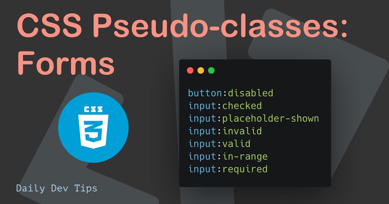
Yesterday we started looking at pseudo-classes that relate to links. In this article, we'll take a look at form-related pseudo-classes.
I've split this up into a series of four, where this is the second part about form pseudo-states.
The other parts:
- Link pseudo-states
- Form pseudo-states (this one 💖)
- Element state selectors (coming soon)
- Other pseudo states (coming soon)
Form pseudo-states
Another significant use case for pseudo-classes is forms.
We already had a glimpse at the focus states, which can also be used on form elements.
But there are some more we can leverage:
:disabled: Element is disabled:enabled: Element is active. However, is the default case so rarely used:checked: Checkbox/radio is checked:indeterminate: Checkbox/radio is not true or false:placeholder-shown: Placeholder is active and has no value:valid: Field is valid:invalid: Field is invalid:in-range: Number field is in range of options:required: Field is required:optional: Field is optional, again a default state so rarely used
:disabled & :enabled
As mentioned in the descriptive text for :enabled, it's also a default state, so it's not often used. As we instead use the main selector to style on.
We can use the :disabled state to indicate when a form field is disabled, and the user can't change anything in there.
Let's say we have a button that is disabled until they fill out all fields, for instance. It's an excellent way to showcase that it's not yet valid to the user.
button:disabled {
  background: lightGray;
  color: #333;
  cursor: not-allowed;
}
You can see the difference in the following CodePen.
:checked & :indeterminate
The checked and indeterminate pseudo-classes can help style checkboxes and radio buttons.
The checked class will fire if the element is on, and indeterminate is funny as it targets non-binary states.
What does that even mean? A checkbox can be on/off right, but there are rare cases where it can be neither. And that's precisely where indeterminate kicks in.
Note: To be honest never needed for it in my life
How can we style with the checked state?
input[type='checkbox']:checked {
  box-shadow: 0 0 0 3px hotpink;
}
I'm using the box-shadow here as this is one of the view things that work well for checked states.
If you plan to style the checkbox further, it might be best to opt for a custom checkbox.
As for the indeterminate, it's not worth going into detail here as it's such a niche use-case.
CSS-tricks has an excellent article on it if you wish more information.
Try it out in this CodePen.
:placeholder-shown
Before, I dedicated a more detailed article about the CSS :placeholder-shown pseudo class.
It can be used to indicate which fields have their placeholder showing.
input:placeholder-shown {
  border: 5px dashed teal;
}
Which results in this:
Note: Try and add a value in the bottom input. It should change the appearance.
:valid, :invalid, & :in-range
These are validation classes and can be used to showcase a field that is not valid.
Let's use an email field. It's the easiest to showcase both the invalid and the valid states.
We can add a red/green border and shadow based on the validation state like so:
input:invalid {
  border: 2px solid red;
  box-shadow: 0 0 2px red;
  outline: red;
}
input:valid {
  border: 2px solid green;
  box-shadow: 0 0 2px green;
  outline: green;
}
You can try it out in the below CodePen by adding a non-email and email value.
The in-range one is in line with these two and can be used for number fields to determine if they are in the correct range.
input:in-range {
  border: 2px solid green;
  box-shadow: 0 0 2px green;
  outline: green;
}
You can also try this one out, but pick a number between 1 and 10. (Which is the range for the number input)
:required & :optional
This can be used to determine if a field is required or not. The optional state is the default state, so it is unnecessary to state this explicitly.
input:required {
  background: orange;
}
This will give all required fields an orange background.
Thank you for reading, and let's connect!
Thank you for reading my blog. Feel free to subscribe to my email newsletter and connect on Facebook or Twitter

