For today's article, we'll recreate the iconic Netflix logo. While working on this logo, I found it was quite an easy one.
Super fun to try yourself 💖
Let's take a look at the logo.

Analysing the logo
The logo is built up by three sticks of the same size; however, the middle one casts a shadow and is skewed.
Then at the bottom, it's good to note the logo is a bit rounded off.
My idea is to leverage borders for the two side pillars and pseudo-elements to make the skew stick + the rounded bottom section.
Recreating the Netflix logo in CSS
Let's create a simple box and set the borders left and right to get started.
.netflix {
  height: 15rem;
  width: 3rem;
  border-left: 3rem solid #e50914;
  border-right: 3rem solid #e50914;
  position: relative;
}
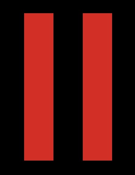
It's important to note the 3rem will be the size for each stick.
So far, we get the following styled element.

Let's add a before element to add the third skew line. The main idea is that this can be simply the width and height of the box.
&:before {
  display: block;
  content: '';
  width: 100%;
  height: 100%;
  background: #e50914;
  transform: skewX(21.5deg);
  box-shadow: 0 0 30px black;
}
We can see we skew the element to fit the edges and add a bit of box-shadow to cast the shadow on the sticks below.
The last thing we need is the bottom rounded effect. We'll leverage a round box that we offset from the bottom.
&:after {
  content: '';
  width: 15rem;
  height: 2rem;
  background: black;
  border-radius: 50%;
  display: block;
  position: absolute;
  left: -200%;
  top: 98%;
}
Which result in the following CodePen.
Thank you for reading, and let's connect!
Thank you for reading my blog. Feel free to subscribe to my email newsletter and connect on Facebook or Twitter

