As you may have seen throughout my articles, I'm a big fan of Emojis.
Today we'll be looking at getting emoji as our list icons. I will be using the stable method for this article. Tomorrow we will explore a newer method of doing just this.
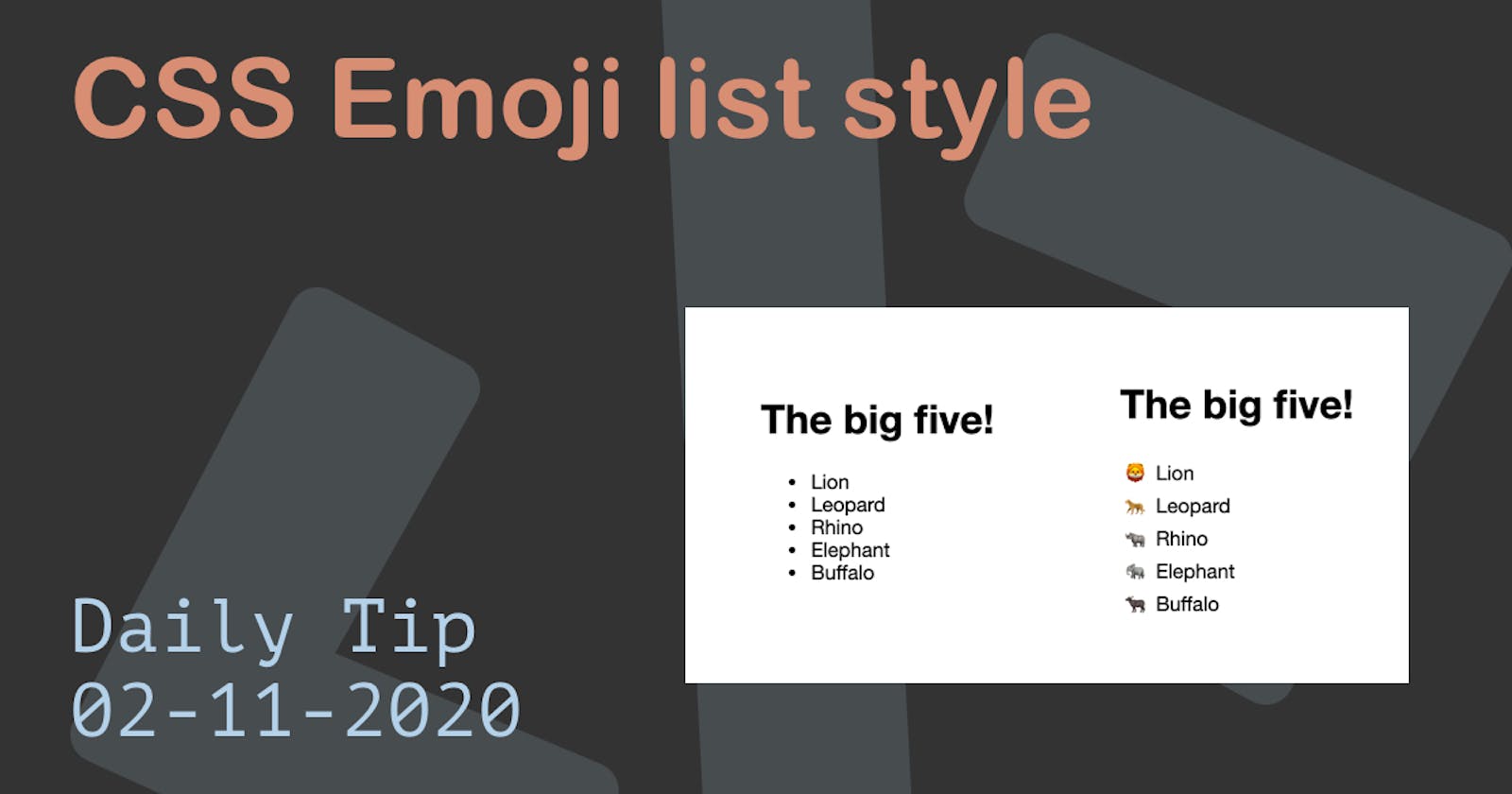
The end result will be us transforming the left list into this right one.
Try it out using this Codepen.
HTML Structure
<div>
  <h1>The big five!</h1>
  <ul>
    <li>Lion</li>
    <li>Leopard</li>
    <li>Rhino</li>
    <li>Elephant</li>
    <li>Buffalo</li>
  </ul>
</div>
<div>
  <h1>The big five!</h1>
  <ul class="styled">
    <li>Lion</li>
    <li>Leopard</li>
    <li>Rhino</li>
    <li>Elephant</li>
    <li>Buffalo</li>
  </ul>
</div>
As you can see twice the same list, only the second one has a class styled.
Now we want to make the difference between a boring list and a cool emoji list!.
CSS Emoji list-style
To get the emoji list-style we first will remove the actual styling from the list.
The list-style: none will remove the default bullets and then we set the padding and margin to be zero.
.styled {
  list-style: none;
  padding: 0;
  margin: 0;
}
The next step is to give the list items some space.
This will give us a indent on the left where we can use the before selector to showcase our emoji.
.styled li {
  padding-left: 1rem;
  text-indent: -0.75rem;
}
And the third and final step to showcase the emoji.
We are using the before selector to place the content of the animal.
.styled li::before {
  content: "🦁 ";
}
We can now use the nth-child selector to do the other animals.
.styled li:nth-child(2)::before {
  content: "🐆 ";
}
.styled li:nth-child(3)::before {
  content: "🦏 ";
}
.styled li:nth-child(4)::before {
  content: "🐘 ";
}
.styled li:nth-child(5)::before {
  content: "🐃 ";
}
That's is a way cooler list!
Thank you for reading, and let's connect!
Thank you for reading my blog. Feel free to subscribe to my email newsletter and connect on Facebook or Twitter

