Dialogs are an important part of applications, and so in this article, we'll learn how to create dialogs in Flutter.
We'll be learning how to create a dialog in Flutter and how which options we can use.
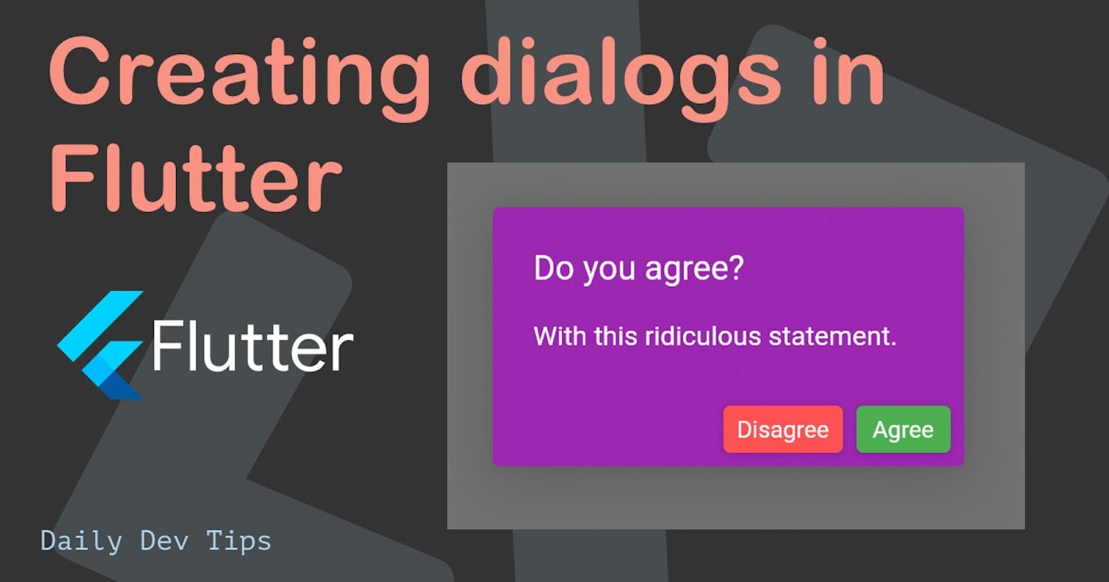
The end result will be a dialog like this:

I'll use my basic flutter app as the starting point if you want to code along.
Creating our first dialog in Flutter
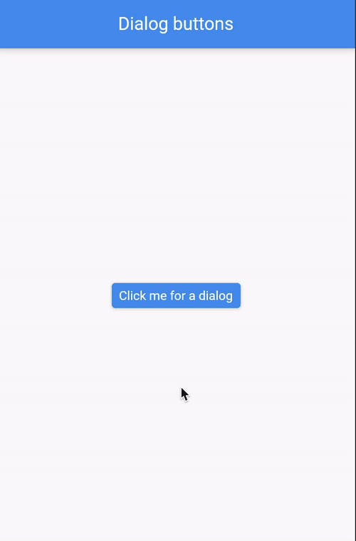
Let's add a simple button to our Flutter application. When we press this button, we want the dialog to show.
Open up your main.dart file and add the following code to get the button we want.
return Center(
  child: ElevatedButton(
    child: Text("Click me for a dialog"),
    onPressed: () {
      showDialog(
        context: context,
        builder: (BuildContext context) {
          return AlertDialog(
            title: Text("Success"),
            content: Text("Saved successfully"),
          );
        },
      );
    },
  ),
);
This will give us a primary button, and once we click that, we get a dialog with some text in it, we can then click anywhere on the screen to close this dialog.
Adding buttons to a dialog
However, sometimes we want to use some buttons on a dialog screen to capture specific actions.
We can do this by passing the attributes of the action, which can hold multiple buttons.
child: ElevatedButton(
    child: Text("Click me for a dialog"),
    onPressed: () {
      showDialog(
        context: context,
        builder: (BuildContext context) {
          return AlertDialog(
            title: Text("Do you agree?"),
            content: Text("With this ridiculous statement."),
            actions: [
              ElevatedButton(onPressed: () {}, child: Text("Disagree")),
              ElevatedButton(onPressed: () {}, child: Text("Agree")),
            ],
          );
        },
      );
    },
),
This will give us a dialog with two buttons, we can add actions to these buttons as we please, for instance just close the dialog:
ElevatedButton(
    onPressed: () {
      Navigator.of(context).pop();
    },
    child: Text("Disagree"),
),
But you can add your custom actions there as well.
Styling the dialog
Another cool part about Flutter in general, including this dialog is that we can style it to our own needs!
For instance we could style the dialog to be very colourful:
showDialog(
    context: context,
    builder: (BuildContext context) {
      return AlertDialog(
        backgroundColor: Colors.purpleAccent,
        title: Text(
          "Do you agree?",
          style: TextStyle(fontSize: 20, color: Colors.white),
        ),
        content: Text(
          "With this ridiculous statement.",
          style: TextStyle(color: Colors.white),
        ),
        actions: [
          ElevatedButton(
            style: ElevatedButton.styleFrom(
              primary: Colors.redAccent,
            ),
            onPressed: () {
              Navigator.of(context).pop();
            },
            child: Text("Disagree"),
          ),
          ElevatedButton(
              style: ElevatedButton.styleFrom(
                primary: Colors.greenAccent,
              ),
              onPressed: () {},
              child: Text("Agree")),
        ],
      );
    },
);
This is, of course, a pretty eccentric example, but as you can see, almost every element of the dialog can be custom styled. It's cool that we get so much freedom in styling elements in Flutter.
With this, I want to end the article. I've uploaded the most extended example to GitHub to see the complete code.
Thank you for reading, and let's connect!
Thank you for reading my blog. Feel free to subscribe to my email newsletter and connect on Facebook or Twitter

