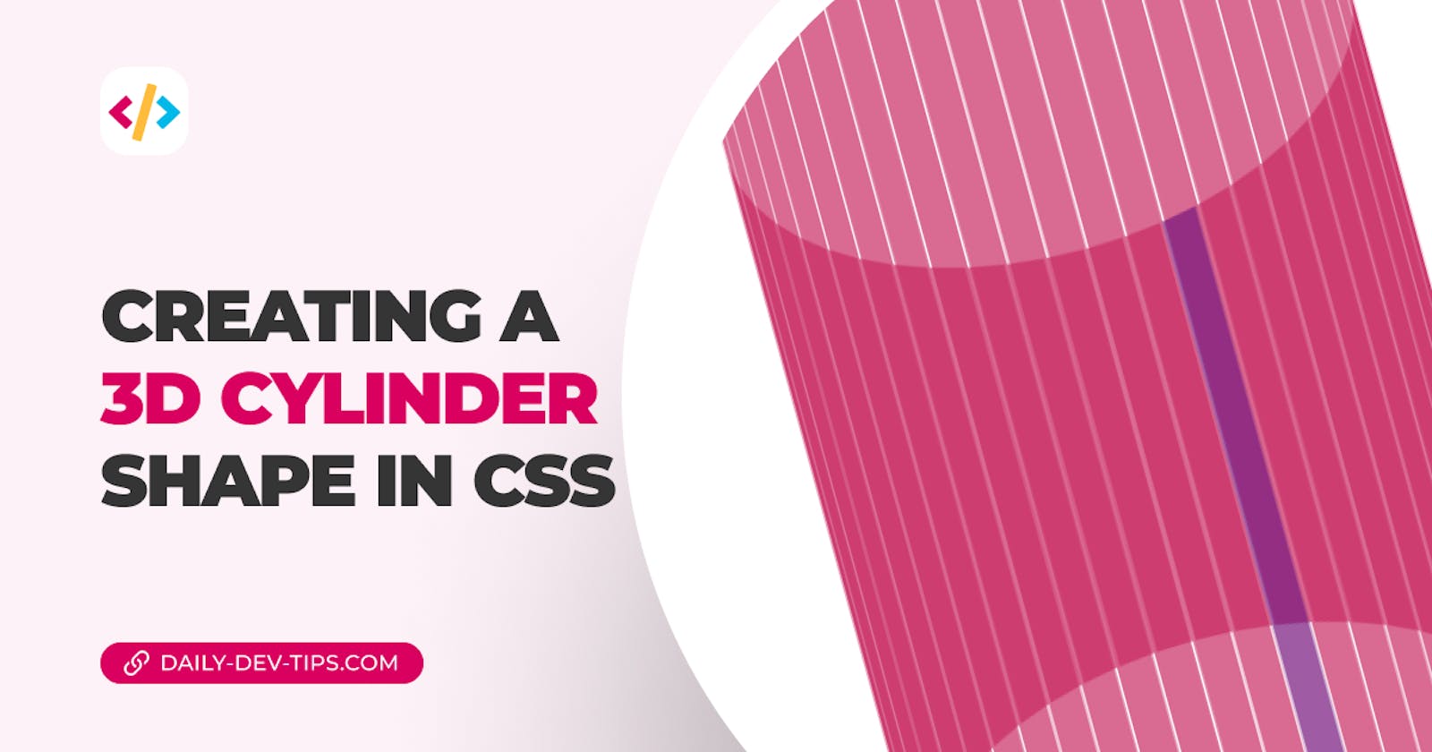
Now that we created a dice and a pyramid in CSS, let's move on to a complex shape: The cylinder.
We have to mimic the cylinder because we don't have a CSS native box for round objects.
In my case, I'll be adding a lot of side panels that we skew next to each other. This will mimic the 3D effect we are looking for.
The result for today will be this excellent-looking cylinder shape.

HTML markup
I choose to make my demo in Pug. It's easy to mock up HTML as it can use variables.
However, what it comes down to is the following HTML output.
<div class="holder">
  <div class="cylinder">
    <div class="face" style="--index: 0;"></div>
    <div class="face" style="--index: 1;"></div>
    <!-- More faces! -->
  </div>
</div>
I've added the holder wrapper so we can put that one at an angle without interfering with our actual cylinder.
I've added the following classes to the holder to achieve the slanted look.
.holder {
  transform-style: preserve-3d;
  transform: rotateX(-35deg);
}
Styling a CSS 3D cylinder
Before we start, we need to define some variables as this one requires some calculation power.
I've decided to use SCSS as it's the easiest to use with variables.
Add the following variables in your CSS.
$pi: 3.14159265358979;
$cylinder-width: 100vw;
$face-count: 50;
$face-deg: (360deg / $face-count);
$face-width: ($cylinder-width / $face-count);
$face-shift: ($cylinder-width / $pi / 2);
Let's go over each one.
pi: Matches PI, which we need to calculate a perfect circle shift sizecylinder-width: The width of our cylinderface-count: How many faces we render. This should match the number of divs you addedface-deg: How much degree each face should coverface-width: The width of each faceface-shift: We need to shift the faces outward to give it more of a round 3D effect
Now we can move on to the cylinder shape.
.cylinder {
  position: relative;
  height: 50vw;
  width: $cylinder-width;
  transform-style: preserve-3d;
}
Nothing fancy here, but it basically will contain the wrapper for our cylinder sides.
Then we can move on to each face, sharing the same styling.
.face {
  position: absolute;
  background-color: #da0060;
  opacity: 0.7;
  height: 100%;
  width: $face-width;
  top: 50%;
  left: 50%;
  transform: rotateY(calc(#{$face-deg} * var(--index))) translateZ(
      calc(#{$face-shift} - -6px)
    );
}
Each face is positioned with the width we calculated. The main magic happens in the transform property.
We change the rotation on the Y axis, which places each face next to the other in a perfect circle.
So face one will get 7.2deg offset and the second one 14.4deg until we hit 360.
Note the 7.2 comes from 360 degrees / 50 (faces)
The translateZ is to push each item back a bit more, making it appear neater and more space.
I also decided to color one face differently to see the rotation better.
.face {
  &:nth-child(1) {
    background: purple;
  }
}
Animating the cylinder
Let's add some animation to make the cylinder spin around.
@keyframes spin {
  to {
    transform: rotateY(-360deg);
  }
}

.cylinder {
  animation: spin 7s infinite linear;
}
This will make the cylinder spin around the Y axis for 360 degrees.
You can see the result in this CodePen.
Thank you for reading, and let's connect!
Thank you for reading my blog. Feel free to subscribe to my email newsletter and connect on Facebook or Twitter

