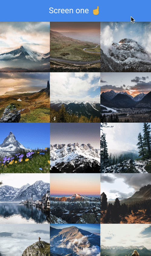
In today's article, I'll be making a photo grid view in Flutter. It's much like you see in, for example, the Instagram app.
By the end of the article, you end up with a result like this:

To start with this, I'm using my previous article where we had a list view as the starting point.
Creating the PhotoItem class
Before we go and build this awesome app, let's first define our class that will keep our photo object.
class PhotoItem {
  final String image;
  final String name;
  PhotoItem(this.image, this.name);
}
Nothing fancy. It will just keep an image and the name of the author. Feel free to add some more details to this.
Let's also create a list of photo items we can use in our grid view.
You can place the following code in the RouteOne widget.
final List<PhotoItem> _items = [
    PhotoItem(
        "https://images.pexels.com/photos/1772973/pexels-photo-1772973.png?auto=compress&cs=tinysrgb&dpr=2&h=750&w=1260",
        "Stephan Seeber"),
    PhotoItem(
        "https://images.pexels.com/photos/1758531/pexels-photo-1758531.jpeg?auto=compress&cs=tinysrgb&dpr=2&h=750&w=1260",
        "Liam Gant"),
];
These are two items in our array. You can add as many as you need.
Render the grid view in Flutter
Now let's have a look at how we can render these items inside a grid view.
As the body of our RouteOne widget, we use a Gridview.builder, with that, we can use its own item builder to render each element.
body: GridView.builder(
    gridDelegate: SliverGridDelegateWithFixedCrossAxisCount(
      crossAxisSpacing: 0,
      mainAxisSpacing: 0,
      crossAxisCount: 3,
    ),
    itemCount: _items.length,
    itemBuilder: (context, index) {
      // Item rendering
    },
),
Let's quickly see what's going on here. The builder can use a delegate that holds the setup of the grid. As you can see, I opted for no space, so all elements are touching each other. And set the count to three elements, meaning each row will hold three items.
Then we define the item count, as we also did for the Flutter list view.
And lastly, we have the item builder, which will loop over each item and can return a widget.
The return for this widget for us will look like this:
return new GestureDetector(
    onTap: () {
      Navigator.push(
        context,
        MaterialPageRoute(
          builder: (context) => RouteTwo(
              image: _items[index].image,
              name: _items[index].name),
        ),
      );
    },
    child: Container(
      decoration: BoxDecoration(
        image: DecorationImage(
          fit: BoxFit.cover,
          image: NetworkImage(_items[index].image),
        ),
      ),
    ),
);
As you can see, I'm wrapping my widget in a gesture detector. We want this to make each element clickable.
The child will be a container widget including the image for each photo item we defined.
Navigate to the detail page
As you can see above, we included a gesture detector to add a tap function. Meaning when we click an item in our grid view, it pushes to the navigation stack. We then pass the image and name to route two.
I've modified route two to be able to receive these two elements.
class RouteTwo extends StatelessWidget {
  final String image;
  final String name;

  RouteTwo({Key? key, required this.image, required this.name})
      : super(key: key);
}
As well as in the named route definition:
MaterialApp(debugShowCheckedModeBanner: false, initialRoute: '/', routes: {
  '/': (context) => RouteOne(),
  '/detail': (context) => RouteTwo(image: '', name: ''),
}),
Now all that's left is to render the image bigger and show the person's name who's picture this is.
body: Column(
    children: [
      AspectRatio(
        aspectRatio: 1,
        child: Container(
          width: double.infinity,
          child: Image(
            image: NetworkImage(image),
          ),
        ),
      ),
      Container(
        margin: const EdgeInsets.all(20.0),
        child: Center(
          child: Text(
            name,
            style: TextStyle(fontSize: 40),
          ),
        ),
      ),
    ],
),
I'm using a column widget to render two child elements. One being an aspect ratio to maintain our image size, and one is the name of the person who owns this picture.
So with this article, we learned how to create a list of custom items, created a grid view in Flutter, and have the option to navigate to a detailed screen with more information.
If you want to view the full code example, visit the GitHub repo for this code.
Thank you for reading, and let's connect!
Thank you for reading my blog. Feel free to subscribe to my email newsletter and connect on Facebook or Twitter

