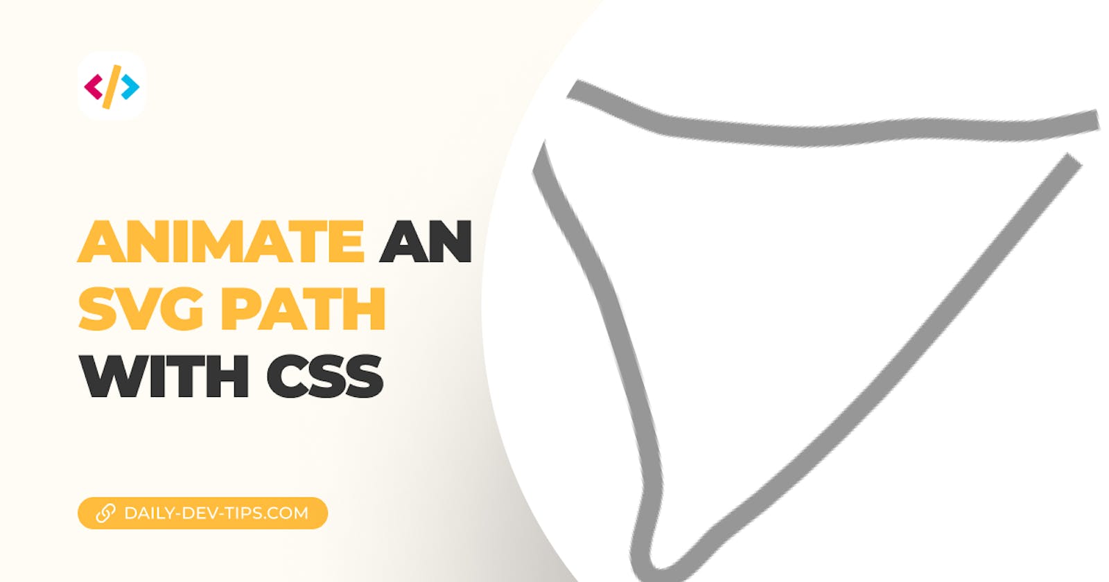
A while ago, I found this super cool effect that animated an SVG path as it was drawn on the canvas.
It turns out it's pretty easy to create this with CSS, so let's see how it's done.
Animating an SVG path with CSS
The first part was to create an SVG line, and I used sketch to draw a triangle-looking element. You can draw anything you want or even use online free tools.
Once your shape is complete, add it to your HTML. For reference, here is my one.
<?xml version="1.0" encoding="UTF-8"?>
<svg
  width="291px"
  height="260px"
  viewBox="0 0 291 260"
  version="1.1"
  xmlns="http://www.w3.org/2000/svg"
  xmlns:xlink="http://www.w3.org/1999/xlink"
>
  <title>Path</title>
  <g id="Page-1" stroke="none" stroke-width="1" fill="none" fill-rule="evenodd">
    <path
      d="M273.097656,120.507813 C201.899566,163.577543 130.777516,213.94793 50.8398438,240.160156 C36.9248074,244.723012 17.4914196,262.184399 8.2265625,250.84375 C-1.53762975,238.89189 20.198756,222.272258 24.0078125,207.316406 C27.3670238,194.126823 28.5689142,180.441602 29.6132812,166.871094 C30.9603726,149.366986 31.1766739,131.782428 31.171875,114.226563 C31.1623478,79.3735161 8.15793288,37.1795952 29.5703125,9.6796875 C43.1473611,-7.75730878 67.7544299,32.013528 87.5742187,41.7890625 C105.639606,50.6992894 124.365537,58.2317755 143.085938,65.6679688 C150.003672,68.4158594 157.202901,70.4330349 164.40625,72.3085938 C177.173796,75.6329203 190.335014,77.4306133 202.960938,81.2578125 C220.824973,86.6728004 237.747783,94.999359 255.734375,99.9921875 C266.927708,103.099302 278.679688,103.638021 290.152344,105.460938"
      id="Path"
      stroke="#979797"
      stroke-width="10"
    ></path>
  </g>
</svg>
Now we can move to animate it, and since I'm only using one SVG, I added the code to the main SVG element.
The first thing we want to do is set the stroke dash array, and its offset.
svg {
  stroke-dasharray: 1000;
  stroke-dashoffset: 1000;
  pointer-events: none;
}
The dash array refers to the width of the dash and the offset to the starting point. 1000 is bigger than our actual line so it will be split into 1000 pieces.
Then we want to add an animation that removes the offset over time.
svg {
  animation: animateDash 2s linear forwards infinite;
}
Then we can create the animation to remove the offset, as mentioned.
@keyframes animateDash {
  to {
    stroke-dashoffset: 0;
  }
}
And that's it. Our animation will now run to show the drawing of the line.
You can even play with this and change the array and offset sizes, which will impact how your animation runs, and you can even make it appear as a dashed border animation.
For reference, you can see the result in this CodePen.
Thank you for reading, and let's connect!
Thank you for reading my blog. Feel free to subscribe to my email newsletter and connect on Facebook or Twitter

