I'll be honest with you, I've made this mistake we will look at in this article many times before.
The mistake we are talking about is content flow. In simple terms, which direction does your content flow in?
When we write our code, there is some semantic follow-up.
<div>1</div>
<div>2</div>
<div>3</div>
<div>4</div>
As you can see, these divs are represented in a logical order in the dom. The main thing is screen readers will always read it in this way.
However, with the magical powers of CSS, we can manipulate the order and reverse it.
For example, we could wrap it on the above and apply flex-direction: column-reverse;.
Now the visual user will see the following flow:
4
3
2
1
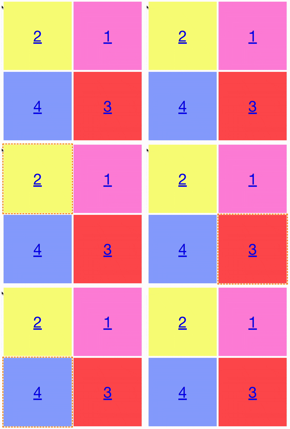
You might think, alright, but why does that matter? And it gets confusing when we convert these elements into cards and try to use keyboard navigation.

In the video above, we can see the keyboard navigation focusing on the correct flow, but for a visual representation, it's super unclear why the flow we see isn't represented.
You can even try it yourself in this CodePen.
When to be careful?
So, while writing this article, I looked at my website and still reversed some visual elements.
Including my mobile article cards, they switch around the image and the title visually. But seeing as they are not separate tab elements, I found no harm in this.
Although, I've reached out to some accessibility experts to get their opinion on it.
My guidance at this point is never to change the focus order from the source order. However, you could make exceptions if it makes better visual sense for elements that don't receive direct focus. (Keep this to a minimum)
Action item
Try and navigate through your website. Is the tab order the same as the visual order?
You'll be surprised by how many modern websites the tab order is wrong.
Thank you for reading, and let's connect!
Thank you for reading my blog. Feel free to subscribe to my email newsletter and connect on Facebook or Twitter

