Let's set one thing straight before we even dive into the article.
Divs are not buttons!
Yes, they are sometimes easier to style, but we should always opt for semantic HTML when introducing actionable items.
Alright, that's out of the way. Now, let's dive into the matter of links vs. buttons.
Is there a difference?
When we browse the modern-day web, you'll struggle to differentiate buttons from links (let aside divs). Many style these elements the same, but this is not the case for screen readers.
They can still easily distantiate between the two.
When to use a link or a button?
I see people frown and wonder, ok, I get it, but when do I use which one?
And the answer to that is straightforward.
- A link will trigger a URL change.
- A button will trigger an action.
Let's look at some examples of valid links.
Our main navigation menu: <a href="mywebsite.com/about">About</a>.
A one-pager layout: <a href="#contact">Contact</a>
Key point: If it's changing the URL, use a link!
And around the button, they adhere to almost all other interactions on your website.
For example form submits: <button type="submit">Send contact request</button>.
But they can also include certain actions for instance liking a article: <button aria-label="upvote" onclick="upvoteArticle()"><svg /></button>.
There will be a ton more of the button examples, but keep the basic two rules in mind. It's all you ever need.
- URL change occurs? 👉 Link
- No URL change? 🫢 Button
What about styling?
Now, we know we can style buttons as links and links as buttons.
But what is valid?
If we looked at how the web is supposed to work, I would strongly urge you to keep elements as they are.
Links should be identifiable by users as such, and the same goes for buttons. However, when this is impossible for whatever reason, still opt for the right semantic solution.
So, how do screen readers see them?
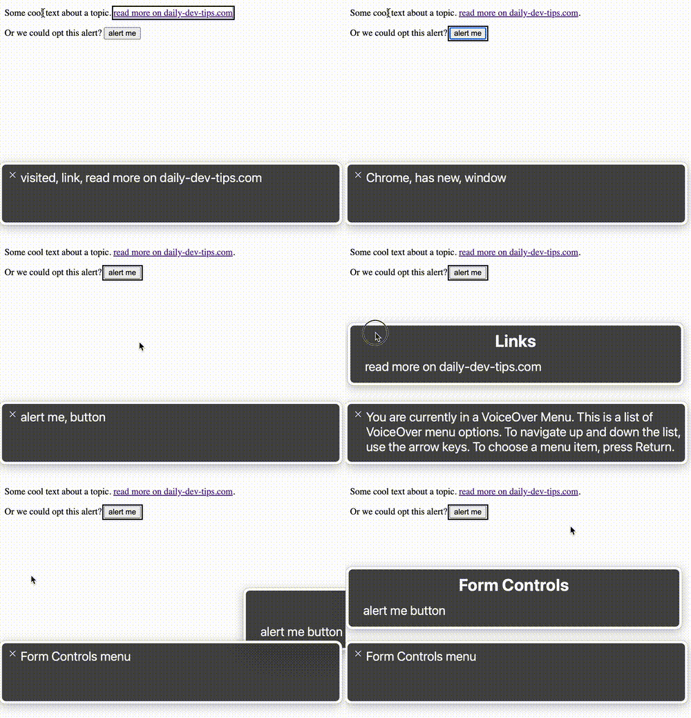
Let's set up a simple test by adding a button and a link and see what happens.
<p>
  Some cool text about a topic.
  <a href="https://daily-dev-tips.com">read more on daily-dev-tips.com</a>.
</p>

<p>
  Or we could opt this alert?
  <button onclick="alert('Hi there')">alert me</button>
</p>
When using keyboard navigation, we can tab onto both elements. However, the interactions are different.
- Link: We can press enter, and it's collected in the Links window
- Button: We can press enter or space, and it's collected in the Form controls window

Within the demo, we see the Mac VoiceOver link and button behavior. You can see the links are announced as such, and the button as well. For the button, we can either press enter or tab.
In the last section of the video, we see the voiceOver rotation menu. This is a way to go over all types of elements. It's important to note that people use this to identify all links or buttons quickly.
If you style your links as buttons, people might not even find them.
And if you style buttons as links, they might get surprised by unexpected behaviors.
Conclusion
Picking the right semantic element is very important. Use links for URL changes and buttons for any other actions.
And for those who forgot, don't use divs! 😈
Thank you for reading, and let's connect!
Thank you for reading my blog. Feel free to subscribe to my email newsletter and connect on Facebook or Twitter

