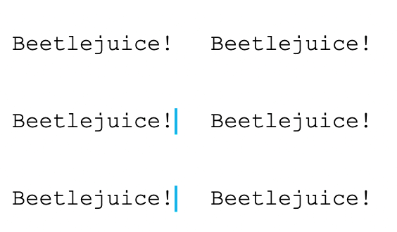
In this article, we'll be creating a typewriter effect in CSS! We won't be needing any JavaScript to achieve this effect and the result will look like this:
Alright, let's get started!
Setting up the HTML
As for the HTML, we don't really need much. We just want a paragraph or text element that we can manipulate.
<div>
  <p>Beetlejuice, Beetlejuice, Beetlejuice!</p>
</div>
Then let's quickly add some basic styling so the text is centred:
body {
  min-height: 100vh;
  display: grid;
  place-items: center;
}
And now we can add some basic styling to make the text stand out a bit more.
p {
  font-size: 2rem;
  font-family: "Courier New";
}
By now, it should look something like this:

Adding the blinking type caret
Let's start by adding the blinking type caret at the end. This type of caret indicates a typewriter effect in most applications; I'll be using the one from iAWriter, which is a blue one.
We can achieve this blinking caret by leveraging the right border of the p element like so.
border-right: .15em solid #18BDEC;
To animate this, let's create a blink animation that will run forever.
animation: blink 1s steps(1) infinite;
This blink animation will be super simple as it only needs to change the border-color to be transparent halfway.
@keyframes blink {
  50% {
    border-color: transparent;
  }
}
By adding the 1 step in the animation, we create the quick blink effect instead of a slow fade.
Resulting in the following:

The typing effect
Now it's time for the actual typing effect.
We first want to make the p tag have 0 width and not wrap to other lines or show the overflow.
width: 0;
overflow: hidden;
white-space: nowrap;
Then we want to add the animation. Since we already have an animation in place, we can use a , to separate the two.
animation: typing 4s steps(38) 1s 1 normal both, blink 1s steps(1) infinite;
I used 38 steps as there would be 38 characters in my paragraph.
Let's have a look at how this typing animation should look.
@keyframes typing {
  from {
    width: 0;
  }
  to {
    width: 100%;
  }
}
Yep, that's it, a simple 0 to 100% width animation. And it will give us this cool typewriter effect we are looking for.
To make your animation fit your text and font, you might have to play around with the animation settings.
Try playing around with the duration (4s) and the steps to make it work best for you.
I hope you enjoyed this article and learned something new. Do share your creations with me on Twitter! 👀⌨️
Thank you for reading, and let's connect!
Thank you for reading my blog. Feel free to subscribe to my email newsletter and connect on Facebook or Twitter

